The 6 Most Common Non-Apples-to-Apples Comparisons I See in the Hollywood Press
Statistics, Comparisons, and a Guide to Statistical Literacy in a Viral Media World
(Quick reminder: I'm on vacation this week, so no Streaming Ratings Report today. Don't worry, we'll cover two weeks of ratings data next Friday. But to give you something anyway, here's part two of my articles on "apples-to-apples" comparisons, providing the six most common examples of bad comparisons I find in the entertainment media ecosystem.)
If I had a magic wand to fix America’s broken education system, there’s a bunch of things I’d do.
(To “Well, actually” myself, is America’s education in actually “broken”? Not really. Since the 1990s, I’ve read countless pieces about America’s broken education system, and yet America seems to keep chugging along, if not thriving. Why? Well, while most Americans think America’s national education system is failing, they actually love their local schools. We can always do better and we need to fix schools in underserved communities, but if 80% of parents love their schools, our education system isn’t failing! This is perception, due to negative national media coverage, not reality for most people.)
So how would I improve our schools?
I’d increase the length of the school year.
I’d pay teachers more and shrink class room sizes.
I’d teach second languages to students before puberty, which is when young brains can actually learn new languages best.
I’d emphasize phonics.
But more than anything, I’d also require a course on statistics.
That’s a much better use of math education that can help people every day, at work or just reading the news. Most Americans don’t have statistics training and the media only makes it worse with much of their reporting. (’m not sure whether they’re part of the problem or victims of it.)
Anytime you read a statistic, especially the more improbable it is, be skeptical. Be especially skeptical of very big, very round numbers. (There’s an excellent book on this subject called Sex, Drugs and Body Counts by Peter Andreas, and Kelly M. Greenhill, which I’ve linked to before.)
Statistical problems creep into entertainment coverage as well, especially covering the streaming wars. Some of this isn’t the reporters fault; writing 5-10 articles a day is really tough and limits the amount of time devoted to nuance, building data sets, or exploring false leads.
As I wrote about yesterday, one of the biggest problems in entertainment journalism is when reporters, data journalists, and pundits make non apples-to-apples comparisons, often to reinforce their preconceived notions. It’s even worse when entertainment companies do it, because they’re just self-interested.
So without further ado, here’s a few examples of bad apples-to-apples comparisons in entertainment journalism. (I won’t link to specific examples because I try not to call out people by name.)
1. Comparing U.S. Viewership to Global Viewership
Since I started this website and newsletter, I’ve constantly read bad analysis or reporting comparing the ratings of a network or cable channel to a streamer's global ratings.
It was especially frustrating when countless reporters compared Game of Thrones U.S. ratings to Netflix’s global ratings. This just happened again when House of the Dragon debuted, and reporters compared HBO’s viewership of 10 million U.S. customers to Prime Video’s viewership figure of 25 million global customers. This is not apples-to-apples!
One population has a potential audience of around 300 million people; the other is 8 billion people. That’s 26 times larger. The comparison doesn’t work at all.
The streamers often do this as well when they’re reporting their subscriber counts, mixing U.S. only numbers with global subscriber counts, even though U.S. and European subscribers often pay multiples more to subscribe to a streamer than people in developing countries. How are those subscribers even close to the same?
It’s not an apples-to-apples comparison. It’s apples-to-hammers.
2. Comparing U.S. Subscriber Counts to U.S./Canada Subscriber Counts
Here’s another really similar example. Netflix for years reported U.S. subscriber totals, then switched to “U.S. and Canada”, and some media analysts still call it a U.S. number. Or compare it to HBO’s U.S.-only number to this UCan number. (Which is why you need my subscriber estimates.)
Unlike some of the other examples of non-apples-to-apples comparisons, I don’t think there’s any malice here, or even bad data analysis. It takes a lot of time and work to keep track of all these different metrics reported by every company! And the companies themselves don’t have standardized reporting either. So you just have to find data journalists who do put in the work to sort it all out.
I’m not pretending like this is easy; I make mistakes all the time and thank anyone who can point out discrepancies.
3. Comparing “Free Viewership” to Viewership that Costs Money
This is another example that drives me crazy. Often times, analysts just ignore that if something is free, people are more likely to consume it—because, you know, it’s free—which I’ve written about before.
Like, say, comparing the number of people who watched Red Notice on Netflix versus the number of people who bought tickets to see Avengers: Endgame, as I wrote about last year for The Ankler. Why would you compare a film that’s available to all Netflix subscribers to a movie that you have to pay at least $12—but more in many places, like LA and NYC—to go see? And you have to leave your house! (And, as I wrote in that article, Avengers: Endgame was still bigger even taking that into account!)
I’ve also written about this when people compared Mulan’s PVOD sales to Tenet’s box office. As I wrote at the time, “Comparing the box office of Tenet to PVOD of Mulan is comparing two different windows to each other. That isn’t apples-to-apples.” This also happened with The Christmas Chronicles; Netflix said their viewership equalled 20 million tickets sold. (And Slashfilm called them out on it.)
Over the last couple of years, I’ve felt like I’ve had to argue for patently obvious truths and this is one of them. If something is free (or available for free to monthly subscribers), the barrier to consumption is obviously lower than if it costs money.
4. Comparing Paid Subscribers to Unpaid Users
Here’s another free vs. not free comparison: subscriber counts. Less-than-diligent reporters will often compare two services’ subscriber counts even though one may cost real money and the other is free. These two things aren’t the same.
Like when pundits compare cable subscribers—who are paying at least $65 a month to a cable company or an vMVPD—to Netflix subscribers. The best example I’ve ever found were these breathless headlines about Netflix having more subscribers than cable, but the analysis everyone cited only counted the top ten cable companies. So yes, if you take all cable subscribers, then subtract an arbitrary number of cable subscribers, and ignore price, Netflix is more popular than cable.
5. Comparing Binge-Released TV Shows to Weekly-Release TV Shows
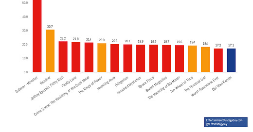
In streaming ratings, it’s often crucial to compare things “apples-to-apples”. Take binge-released series—meaning ten episodes on the same day—to weekly released titles. Without looking at viewership per episode, it looks like Netflix dominates the charts:
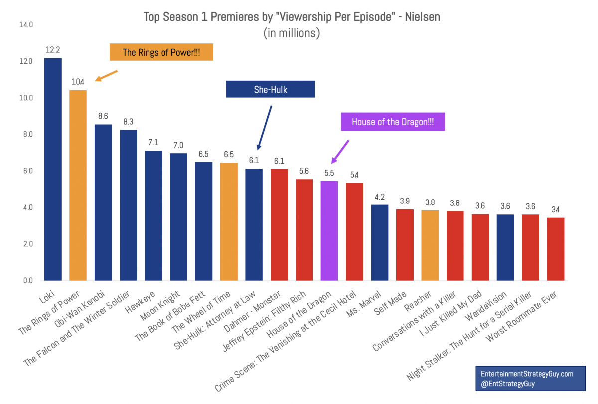
But when you compare viewership per episode—which takes out the variable of how many episodes were released and how long those episodes were—it’s a much closer fight, with Disney claiming nine of the top fifteen shows.
My goal is to cut through the streaming ratings noise and make as many apples-to-apples comparisons as possible. It’s tough and I can’t do it every week for every show, but that’s what I try to do. And trying to compare things “apples-to-apples” is how.
6. Changing the Metrics
One of the more insidious examples of “non-apples-to-apples” data points was when Netflix changed their data points. Initially, they released the number of “households” who watched “70%” of a show or film. They then lowered the bar to households who watched “2 minutes”. Some folks, not knowing the change, compared old viewership to new viewership, and it naturally looked like Netflix had performed better over time.
Then they switched to hours viewed. That’s not the same at all! So I constantly had to adjust my measurements and charts. (All that said, they now lead the industry in openness, providing global hours views for their top ten shows, something Disney, Warner Bros. Discovery, and others haven’t done yet.)
It’s a Dangerous Data World Out There…Be Careful
I could share more examples, but we only have time for so many apples-to-apples comparisons. If you want a rule of thumb, the flashier the headline, the likelier it is to be fake. And if you try to find the non-“apples-to-apples” comparison, you’ll usually find it.
By the way, if you find other good examples of this, send them to me! (Including this website! Hold me accountable.)


